First Impressions and Booking Flow
LINMO, a mobile app for booking wellness and fitness classes, approached me with a challenge: to better understand how new users experience the app during their first visit. Key questions were: Are the payment options clear? Do users understand how to book? Are they confident in what they're signing up for?
I ran a moderated usability study with participants who had never used the app before but were interested in fitness/wellness classes. In 30-minute sessions, I asked each participant to explore the app and try booking a class. This revealed some friction points in the experience.
What I discovered:
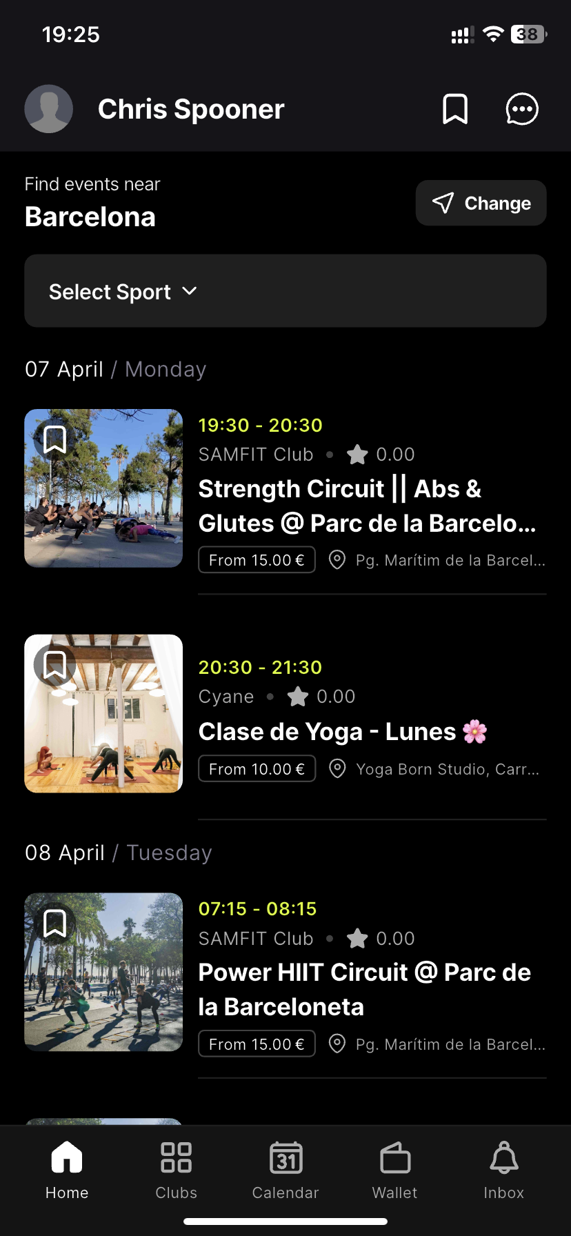
Filters were frustrating. Users often scrolled instead of filtering, mainly because filters sometimes returned no results without explanation.
Language was inconsistent. Some class descriptions mixed Spanish and English, making it unclear what language the class would be taught in.
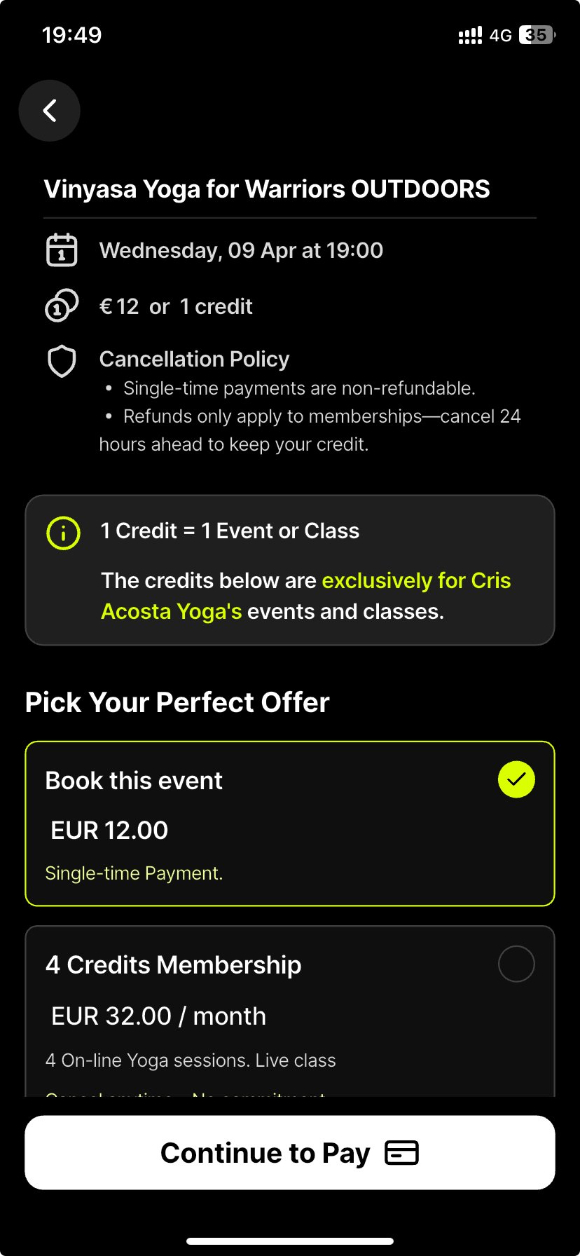
Pricing was confusing. Participants didn’t always understand whether prices were weekly or monthly, or how the in-app wallet and credits worked.
What I recommended:
Make filters smarter and more visible - grey out options with no results, and keep filters accessible while scrolling.
Clearly display the language of each class, and offer consistent translations across all content.
Improve transparency around pricing and wallet usage so users know exactly what they’re paying and getting.
Next Steps:
LINMO has already begun implementing changes, such as additional explanation around credits (middle image below). Future research could include:
Testing changes with new users
Running a similar study with class organisers
Competitor usability benchmarking
This study helped LINMO see their app through the eyes of first-time users and gave them a roadmap to ensure their app can match demand as they scale.